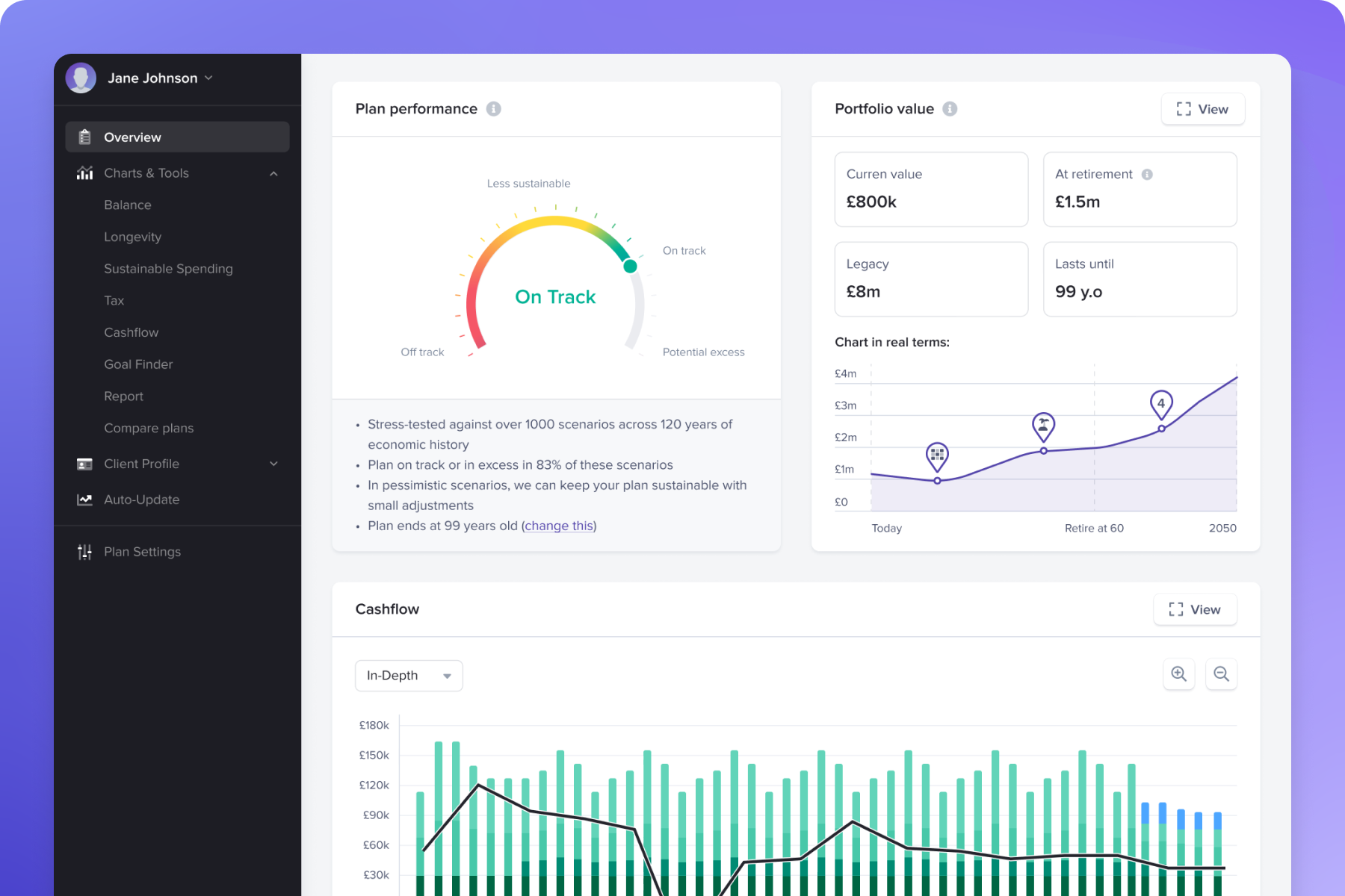


Compare plans and stress test against 100years' capital markets data in a highly visual way that brings it to life for your clients.

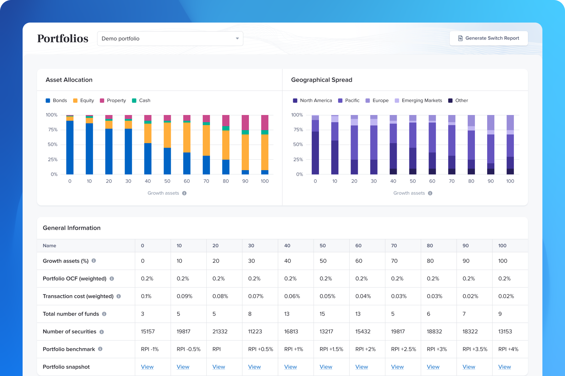
Seamlessly map the appetite for risk to one of our evidence-based model portfolios and manage investments easily via our Control Centre.
In times of uncertainty, financial advisers play a vital role in offering guidance and peace of mind to their clients.
Using market data going back to 1926, the Timeline Charts show how financial markets and major asset classes have behaved across different market environments, helping advisers explain historical investment returns and long-term market behaviour.
Covering global equities, global bonds, UK equities and other major asset classes, the charts bring long-term market history to life. They illustrate not only how markets have performed across decades, but also the risks, volatility and cycles investors experience along the way.
Designed as educational tools, the Timeline Charts help financial advisers and planners add historical perspective to conversations with clients about markets, risk and long-term investing.

The Timeline Charts uses empirical data going back to 1926 to show how inflation, cash, bonds, property, gold, equities and portfolios fared under a wide range of market conditions.


From bull and bear markets, recessions and major events, to political parties and prime ministers/presidents, Timeline chart provides a colourful perspective on how wealth compounds in various asset classes and portfolios over time.
With expert insights and a focus on future opportunities, advisers guide clients toward smart investment decisions — helping them weather the storm and prepare for recovery.


This online tour will show you all the features and benefits of Timeline's unified eco-system for financial planners.
